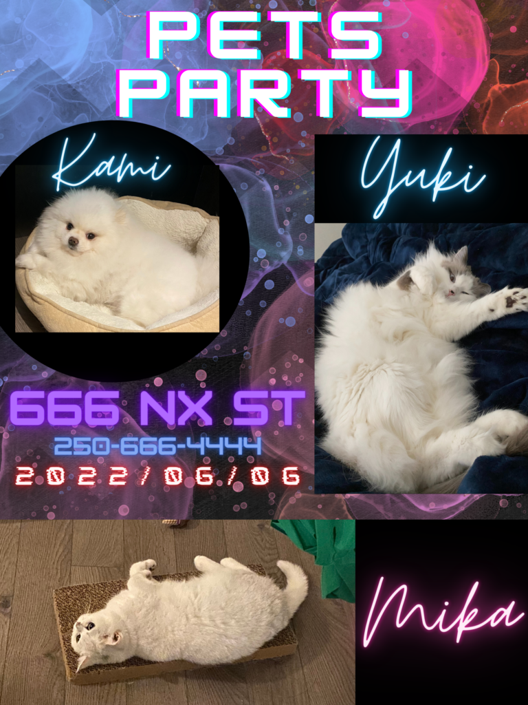
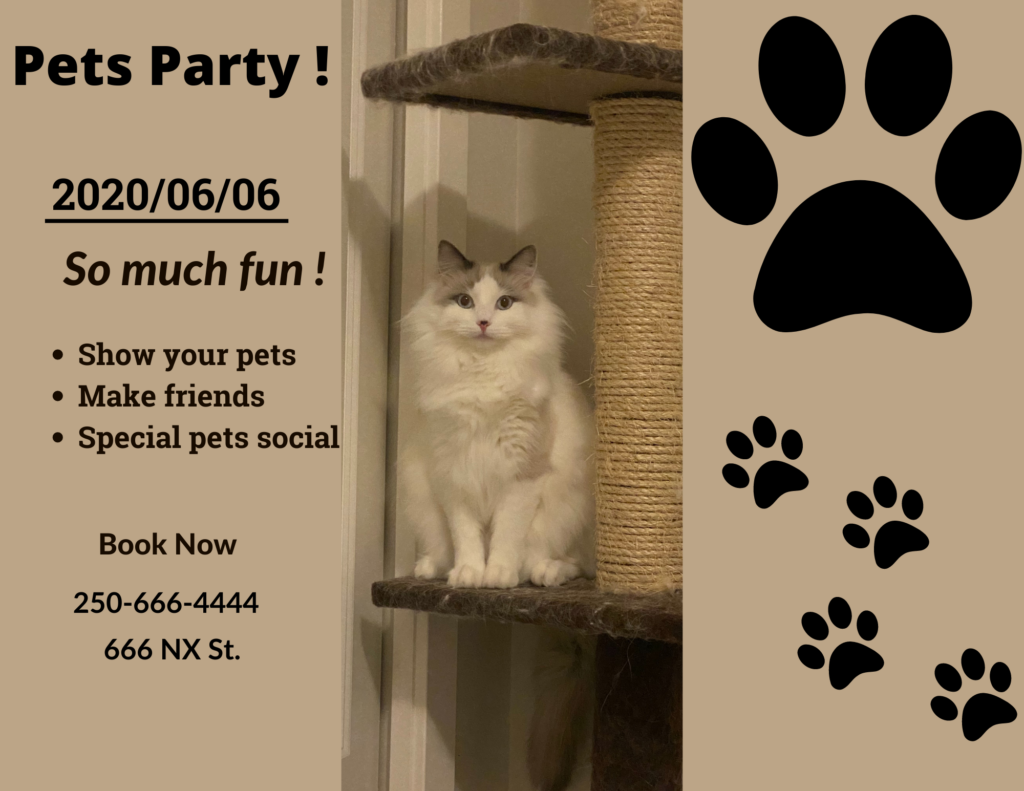
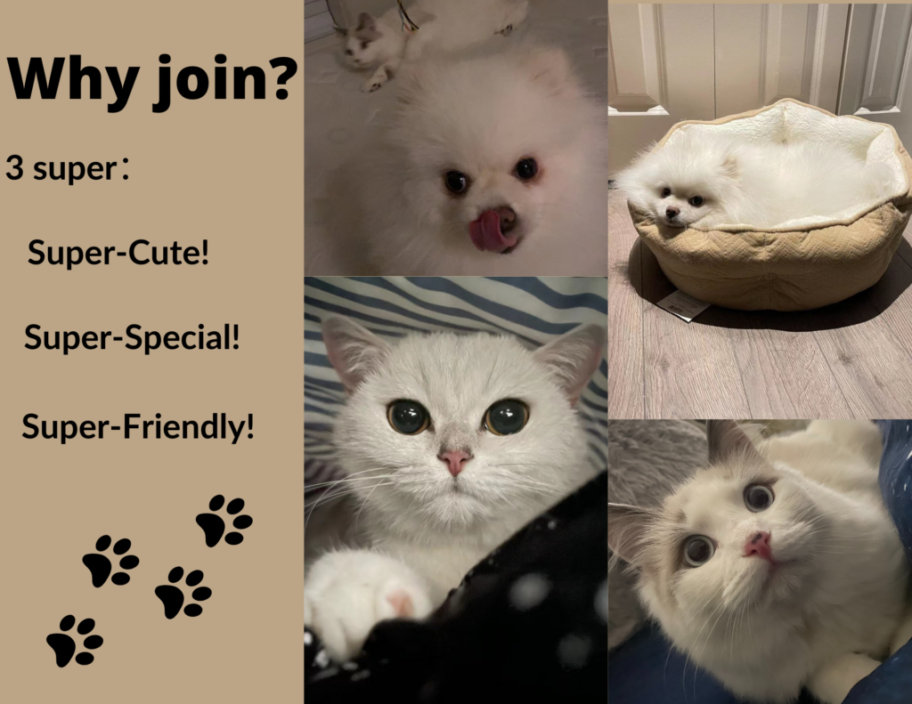
During this week I learned to use Canva to create posters and brochures. The process was very interesting and I had a lot of fun seeing the results of my work. The topic of my poster and brochure was a pet party. I inserted a lot of pictures of my own pets in the posters and brochures, and they were all very cute and friendly. Through this week, I learned how to make my posters and brochures more attractive and that the organizers need to provide as much information as possible to better attract interested people to join.
Here is my poster:

For the posters, I think it is important to keep the number of words low and the words that appear on the posters must be important information. For example, date, address, and contact information. Secondly, the most important thing is an attractive illustration, which can better attract people’s attention.
Here is my brochure:


Regarding the brochure, I think the most important thing is to introduce your advantages and to explain your advantages. This can make the event you hold more convincing while attracting others. Secondly, the brochure should be brief and clear. The point to focus on is to make it easy for people to read.

Leave a Reply
You must be logged in to post a comment.